The New Web Metrics: What You Should Be Prioritizing Now
Your old web metrics are officially obsolete now that AI-powered search is rewriting the rules. Read on to discover the new KPIs that actually matter for your marketing efforts.
Read ArticleTips, trends, and industry news about
All Things Internet®

Mar 20, 2025, 9:17 AM
Your old web metrics are officially obsolete now that AI-powered search is rewriting the rules. Read on to discover the new KPIs that actually matter for your marketing efforts.
Read Article
Feb 27, 2025, 11:30 AM
Corporate video doesn’t have to be boring. Master your B2B video strategy with this no-nonsense guide to planning, production, and marketing success.
Read Article
Jan 30, 2025, 1:00 PM
Lead gen is hard—find a partner who can help you do it better.
Read Article
Jan 16, 2025, 10:30 AM
Learn how to maximize your content marketing strategy with a zero-waste approach. See how you can repurpose a single piece of content into 90+ assets, including videos, blogs, podcasts and more.
Read Article
Nov 25, 2024, 9:15 AM
Need a new idea for your digital marketing strategy? How about 25? Our experts offer up their favorite marketing must-dos to start in the new year.
Read Article
Nov 22, 2024, 6:00 PM
Those little sparkling icons have been popping up everywhere online as a symbol of AI’s transformative power. Informatics’ Jeff Stephens explains the arrival of the “magic sparkle button” and why there will be no stopping it in the future.
Read Article
Nov 15, 2024, 2:50 PM
Whether you're looking to meet federal web accessibility guidelines, or just make your website more usable for all visitors, start with this helpful checklist.
Read Article
Nov 6, 2024, 2:07 PM
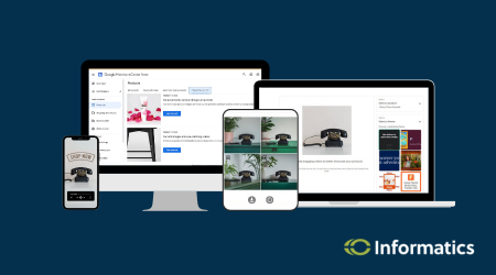
Informatics tested the Google Merchant Centers Product Studio—a suite of free, AI-powered tools meant to enhance and create high-quality product images and videos. Dive in with us.
Read Article
Oct 29, 2024, 2:28 PM
We're thrilled to spotlight one of our own in our latest blog. Read a short interview with Digital Marketing Director Sara Kuennen ahead of the CBJ's awards ceremony for the region's top young professionals.
Read Article
Oct 11, 2024, 4:23 PM
It takes dedicated work and a good digital game to drive local traffic to your business. Our marketing experts break down the 3 strategies you need to know.
Read ArticleOne simple conversation can change your business forever.

Please wait while we set things up for you!