25 Marketing Musts for 2025
Need a new idea for your digital marketing strategy? How about 25? Our experts offer up their favorite marketing must-dos to start in the new year.
Read ArticleTips, trends, and industry news about
All Things Internet®

Nov 25, 2024, 9:15 AM
Need a new idea for your digital marketing strategy? How about 25? Our experts offer up their favorite marketing must-dos to start in the new year.
Read Article
Nov 22, 2024, 6:00 PM
Those little sparkling icons have been popping up everywhere online as a symbol of AI’s transformative power. Informatics’ Jeff Stephens explains the arrival of the “magic sparkle button” and why there will be no stopping it in the future.
Read Article
Nov 15, 2024, 2:50 PM
Whether you're looking to meet federal web accessibility guidelines, or just make your website more usable for all visitors, start with this helpful checklist.
Read Article
Nov 6, 2024, 2:07 PM
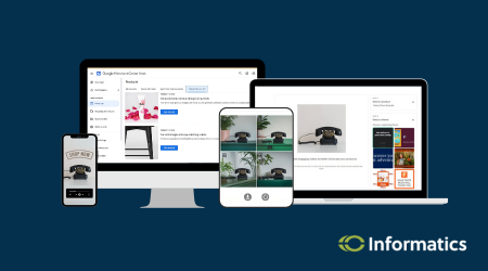
Informatics tested Google Merchant Center's Product Studio—a suite of free, AI-powered tools meant to enhance and create high-quality product images and videos. Dive in with us.
Read Article
Oct 29, 2024, 2:28 PM
We're thrilled to spotlight one of our own in our latest blog. Read a short interview with Digital Marketing Director Sara Kuennen ahead of the CBJ's awards ceremony for the region's top young professionals.
Read Article
Oct 11, 2024, 4:23 PM
It takes dedicated work and a good digital game to drive local traffic to your business. Our marketing experts break down the 3 strategies you need to know.
Read Article
Sep 15, 2024, 12:35 PM
What do variables in Google Tag Manager even do? Learn the basics about variables in GTM, how they benefit you, and when to use the different kinds.
Read Article
Sep 13, 2024, 9:41 AM
Our experts offer up a brief overview of Google Looker Studio, and why you should have a data dashboard for your business if you don’t already. (Our clients do!)
Read Article
Sep 5, 2024, 10:39 AM
Healthcare demands specific marketing strategies to be successful. Our experts offer their recommendations for creating a digital marketing plan that moves the needle for your clinic.
Read Article
Aug 15, 2024, 11:17 AM
Not sure what social media platforms your business needs to be on? Here's a quick tour of five leading platforms (FB, IG, TikTok, X, Threads) and examples from leading companies using them.
Read ArticleOne simple conversation can change your business forever.

Please wait while we set things up for you!